Get artwork done fast and with less complications with these t-shirt design tips.
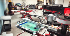
When entering the artwork creating phase, you will want to account for various considerations for screen printing designs. Due to the nature of screen printing and all of the different variables -- such as screen exposure, t-shirt fibers and curing -- graphic design practices for screen printing are different from traditional design that you see on the web or in print form. Here are some tips and considerations when it comes to silkscreen artwork creation.
When working in an vector graphics editor, you should set up your workspace desktop inside the program to facilitate efficiency. One way to do this is by creating a floating toolbar. Put your most used tools on the toolbar so you do not have to keep going into the menu at the top to select them. Screen print designers typically use the alignment, outline, fill and find & replace features the most. Having these as quick buttons on your desktop will speed up art production.
 Keep any outlines in mind as you manipulate your artwork. For example, a left chest logo with a 6-point outline disappears when you scale the image for a full back. To work around this, change your outline to an object. Then, the outline will scale with your image. You will be able to go from a left chest, to a center chest, front, full back, etc...without having to worry about fixing any image outlines.
When designing, be mindful of your line thickness. Most people view (and approve) the image on their monitor, or sheet of paper. While the essence of the image stays the same, the nature of a t-shirt print differs. A shirt is more absorbent than paper, and the printing process drives the platisol ink into the garment itself. This can affect the thickness and boldness of your lines. You can counteract this either through advanced stencil making techniques and sophisticated printing methods (high mesh counts, modified inks, proper off-contact), or by changing your artwork.
Another artwork consideration when designing on a computer is to keep in mind the use of negative space. Most computer monitor backgrounds are white. However, the most popular t-shirt color is black. Take this difference into account during the design phase, as it can change the way you design. For example, car tires on a black shirt typically just need a white outline. An alternative is to create a background for the art file in whatever color your shirt will be. This will force you, or your artist, to design with the shirt color in mind.
Finally, while halftones go from 0 - 100% on paper, t-shirt designers should realistically be somewhere in the 40 - 75% range. Over that amount and your image might look like a full, spot color because of the differences between t-shirt absorption versus paper discussed earlier. If you go under 40%, you might have issues holding the dots on your screen unless you are using very high mesh counts and properly tensioned screens.
While these basic considerations are simply meant to serve as guidelines when designing for screen printing, they will help any beginner screen printer to produce great looking artwork that is ready to be printed on t-shirts.